Running — Part 1: Extracting my Nike Run Club data and exploring in python to evaluate my performance

Anyone who knows me knows that I love sport. Since I was a kid, I always was influenced to practice something and never went long without it. Some sports I've played: swimming, futsal, handball (I still play) and now running, my most recent addiction.
A few months ago, running has become part of my routine. Every week I try to run 2 or 3 times, and always outdoors (I hate treadmills with all my might). To measure my performance, I have been running with the Nike Run Club (NRC) app and recording my runs on it. Looking my data in the app, I felt the need to do more, some analysis of my performance. And is here that another passion comes into to play: data science.
Anyone who also knows me knows that I am a data scientist and rarely believe in anything or make any decision without evidence. It's a bit of cliche, but analyzing everything is also part of my routine, and so, why not bring the data to my side, and like this, who knows, it can help me make decisions that get better my results? This is what I want to start to test. Let's code!
Data extraction
Firstly, I needed the data from my runs. Doing a quick research, I realized that Nike didn't officially instrument to data export, and for get it would be necessary to take alternative paths.
I used a program called nrc-exporter (created by some curious programmer), and it exports data to a local directory easily and quickly. As a first step, we need to install the program in the terminal using pip install nrc-exporter. The annoying part is that we need to provide the program with authentication tokens that Nike generates when you do a login, what is simple but so manual.
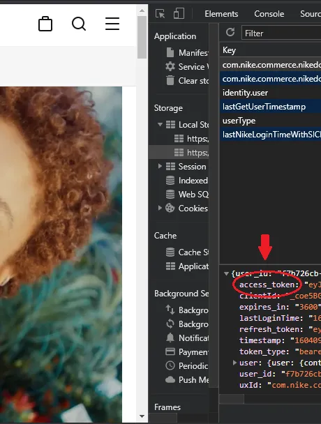
1) Go to the Nike website and do a login normally;
2) Open Developer tools > Application. Then just copy the token like this image:
Now, back in the terminal, just run nrc-exporter with the token, like this:
nrc-exporter -t token
You will see this execution:
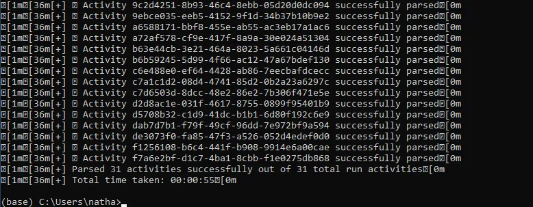
It's ready! All data will be downloaded to a folder called activities and will be inside the folder where you run the script. The file's format will be .json.
If this process doesn't work, there are other ways. I'll leave the link here if you want to know more about nrc-exporter.
Exploratory
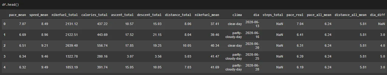
I loaded the files in a jupyter notebook to do the analysis. As all files are .json format, using the pandas json_normalize() function helps a lot.
After the preprocessing, creating, selecting and transforming the variables — as the average pace, for example, which comes in total minutes and not in minutes'seconds' how we normally use —, I wanted to analyze, my final dataframe looked like this:
To contextualize, some descriptive statistics:
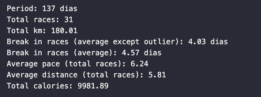
I analyzed a sample of races in the period of 137 days (a little over 4 months). During this period, I ran 31 races totaling 180km! I also calculated the interval average in days between one race and another. Excluding the period that I was unable to run (20 days), that I understood as an outlier that shouldn't be taken in consideration, this interval was 4 days.
Considering these 31 races, the average distance was 5.81km and my average pace was 6'24'' per km. Additionally, with these runs, I burned a total of 9981 calories!
Let’s to the graphical analyses:
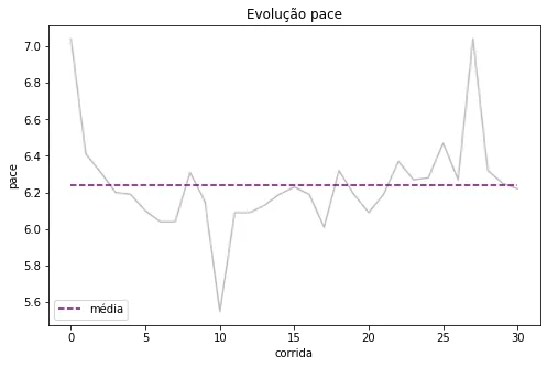
The graph above illustrates the evolution of my average pace throughout the runs and the overall average. We can observe that in my recent runs, my pace has been above this average.
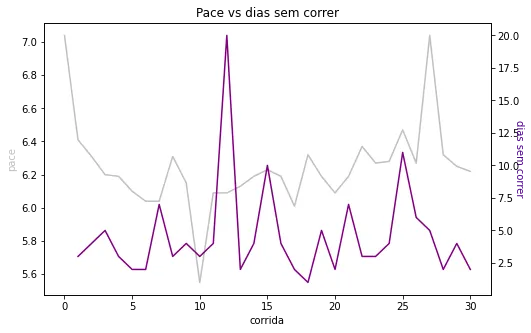
As I mentioned above, I created a variable called "days without running" to try to understand if my pace increased with many days without running. The peaks on the gray line follow the peaks on the purple line in the graph below, confirming what I already suspected: an extended period without exercise may be one of the variables affecting my time.
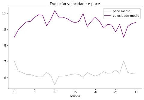
Something a little obvious, but it's also cool to visualize: the opposite trajectory of the average pace and average speed.
Let’s follow:
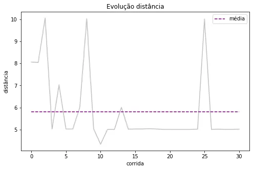
The graph above shows the progression of distances in my runs. The majority of my runs are in the range of 5km, and when I run more than that, I run the double. This is what pushes the average up.
When crossing the average pace data with the distance, we have:
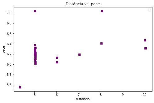
The distribution of my pace in the 5km runs is varied, which doesn't surprise me. Another thing I confirmed looking the image above was the increase in my pace as I increase the distance. There's another aspect that I need to work on.
To analyze calories, I plotted two graphs:


The first one makes clear the positive correlation between calories and distance, meaning if you want to burn more calories, run more (remembering that correlation doesn't imply causality, but in this case, I know it does). The second one doesn't show a correlation between calories and speed. Note that many times I burned almost the same amount of calories, running at different average speeds (probably during the many 5km runs).
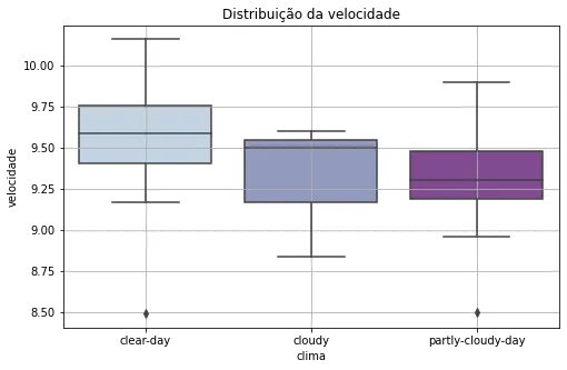
Another feeling I had was that on cloudy days, my performance was a bit better. No sun, and a little breeze, you know how it is... But that's not what the data showed me. The boxplot below suggests that on "clear days," the distribution of my speed is the "best":
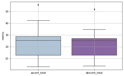
Finally, the distribution of elevation and descent on my routes:
Relevant insights
1) Always run to try to keep/lower my pace for distances that I'm already used to running and consequently be able to improve for longer distances;
2) I need to run longer distances, even with a bad time, if I want to lose more calories;
3) The weather, apparently, doesn't have impact on my performance;
4) Apparently elevation gain doesn't have great correlations with running time and calories. Therefore, I can keep my usual routes if I wanted to change some of these variables.
Some observations for who want to replicate the analysis:
1) It's possible to find the latitude and longitude of the routes in the data, making it possible to georeference the races. In my case I didn't think it was relevant to use, since I almost always run in the same place.
2) As wrote above, the average pace data comes in total minutes, so if like me, you want to look at this more friendly and usual — minutes'seconds'' — it is necessary to treat this variable.
3) Also as wrote above, I didn't find the time information per section, so I preferred not to use it.
There are a lot of people entering/wanting to enter the data analytics/data science area and who need data to train programming or even to build their portfólios. The message I would also share with this post is that there is nothing cooler than using our data for this. In addition to using them for our benefit, generating insights that help us make better decisions (for running in my case), we address topics as treatment and transformation of variables, outliers, data quality and others, clarifying how all of this works in the real life.
Any suggestions are welcome! The complete analysis code can be found on my github.
Enjoy Reading This Article?
Here are some more articles you might like to read next: